Last month I illustrated some of the new Photoshop updates introduced in April, and a few more have come in June, particularly dealing with text. We don’t feature fonts much in this column as it’s mostly to do with images, and in many ways words have always been an awkward companion to digital pictures as turning the shapes into pixels is quite clumsy compared to specific vector based design options.
Certainly lots of paragraphs and tables for example were something better tackled by InDesign or other alternatives, even Word. More recently, however, and with particular developments incorporating AI (yes, better name drop that straight off) Adobe seems keen to ensure PS is a much more competent and comprehensive tool in its new creative democracy.
I always like to draw on a little history, but this time from more recent decades than often, and in earlier digital days budding designers were dedicated to bespoke programmes like Quark which did not have any pixel editing options. Pictures were simply imported and pasted in place - or at least links to them were.
Perhaps in recognition of a whole new generation that is much more familiar working with images effortlessly, and using complex composites of photos, text and graphics, it’s a move to make PS much more of a one-stop tool of choice. It’s also an attempt to cut across the growth and popularity of alternatives like Affinity Design, which can seamlessly manipulate vector and pixel files all in the same workspace.
This digital mixing of two very different formats raises the importance of understanding what each one is and what it does, as the boundaries between them are increasingly blurred. And I use the word blurred intentionally as that’s exactly the consequence of a miss match between them. So without spending too much time on all the wonderful things you can now do with dynamic text in PS, I’d like to spell out the significant differences between what is actually not just two, but three file options.
The reason it’s important for us as printers to understand is that it’s unlikely any of our customers will, and it’s fairly pointless trying to explain as you have to start with pointing out that what they see on the screen of their phone isn’t as real as they think it is, just the visual display of a fairly sophisticated mathematical process. As always, our problem is that we have to turn that into very real hard print, and solve any issues involved, which usually we have played no part in creating. Despite that, it’s still our problem.
Everything we print is made up of dots, toner machines have a finite dpi, as do inkjets although at a much higher resolution. We can only print with the number of dots we are given dictating the size and if we try and print bigger, the image starts to break up and look horrible because it is not seamless. There is a break between one dot and another. Think of those dots as the pixels in the source file. Everything we photograph whether with cameras, on phones, scan, or the majority of images downloaded or emailed will be pixel defined. With a picture file what you have is what you get.
I am sometimes asked if I can scan an image as a vector file, underlining that lack of understanding. The answer of course is no, all I can do is scan as accurately as possible and using a tracing programme turn the pixels into smooth outlines. The mathematics of graphic creations are not restricted by the number of pixels and are called vectors. A vector file, kept in its native state, can be as big as you like if you want to print from it which is why it is preferred for a number of processes.
Photoshop files, of course, have a specific number of pixels by definition, but you can import vector files into them and they effectively float as a layer with variable resolution, much like text and shapes, until you flatten the image, committing everything in it to definite dimensions. This is also referred to as rasterisation as you can raster individual layers, necessary to do some editing functions, not just the whole file.
You can’t use pixel editing tools like the clone, heal or erase option on a vector layer because there are no definite pixels to work on and you will get a caution inviting you to rasterise to continue. This will then limit that layer to the underlying resolution which may not be ideal if it needs to be enlarged, or otherwise stretched. Once a pixel file there’s no going back without cancelling out any of the subsequent editing actions and starting again.
This is a common issue when editing or creating small documents like business cards where set at actual size, even at 300dpi, the text, or any images contained, may be just too low resolution when committed to print. This is usually because the customer has made everything too small, judging by its clarity on screen, not how it will print. But it can happen if a file is being modified for a print run, like a change of address or web details, at which point it becomes your problem not theirs. Best practice is to create at twice the size of output as with pixel restrained images you can always downsize, and rarely upsize successfully.
Which is a neat segway to the third format I teased earlier, the much misunderstood and rarely used Smart Object. Probably one of Photoshop’s best kept secrets, this simple selection is a potential life saver when mixing items of different resolutions in a single, restrictive file. Hopefully you will already be aware that if you combine two images of different resolutions the second image will adopt the resolution of the first, so it may actually be smaller or larger regardless of the external measurements in millimetres.
This can make a small but irritating difference if you are trying to match two files of identical dimensions conveniently for print, and much worse if you are drastically reducing the quality of an image by dragging it into a poorer quality one.
However, if you import the second file as a Smart Object it magically retains its original resolution until you finally decide how to size it and can therefore commit to output without fear of losing any quality. Often files provided from customers are quite poor anyway so it’s important to save as much as possible from any deterioration along the production chain.
If you think of the business card example - if you are dropping a client’s headshot into it, and reduce the portrait down to actual size, you may be discarding hundreds of usable pixels and rendering the resulting image virtually unrecognisable. Not likely to win any Google stars!
The Smart Object, even as a pixel created image, retains the clarity of the original, it is not converted into a vector trace or in any way altered, but like a vector you can’t do any pixel editing until you commit it to a solid, exact image. You can spot whether it is, or isn’t, by the little symbol in the layer panel thumbnail. As it’s quite small and easily ignored, you might want to assign that layer a colour to remind you of its special content until you cancel it.
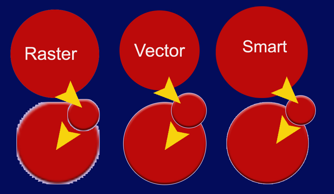
In the illustration of the three red circles they have all been created at the same size, but as the raster file has been made smaller after flattening the original elliptical shape and then been enlarged again, you can see it doesn’t work as it has lost loads of pixels and reveals a jagged edge, whereas the vector shape is completely intact.
The Smart Object does show some pixel edges but nothing like as bad as the rastered file.
The importance of retaining the maximum number of pixels possible cannot be overstressed in image files as they are not some magic formula that can be infinitely modified. As well as clarity they also contain the actual colour information required to display or print the file. The more you have, the more options you have in making alterations, small or large, in order to sort any issues. Less pixels, less chance of doing any corrections.
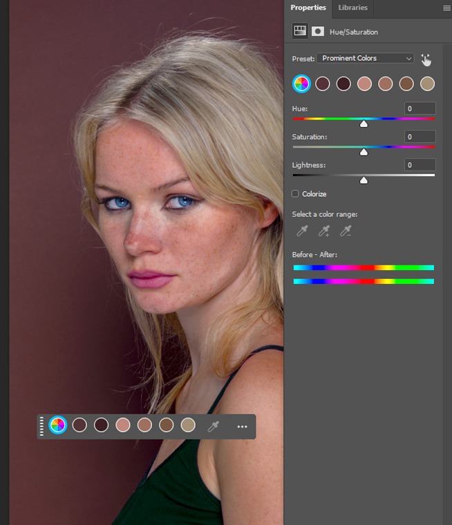
Most images are not solid colour, but composite colour, much like the things we print. Take skin tones, for example, one of the most common print issues as people can put up with the sky not being quite the right shade of blue, but skin tones that don’t look natural are never popular. And those tones are not a uniform hue due to pigments in the skin, as well as the lighting reflected off them.
Photoshop is now getting some very clever and quite subtle ways of harmonising colour, which is particularly important with people’s features.
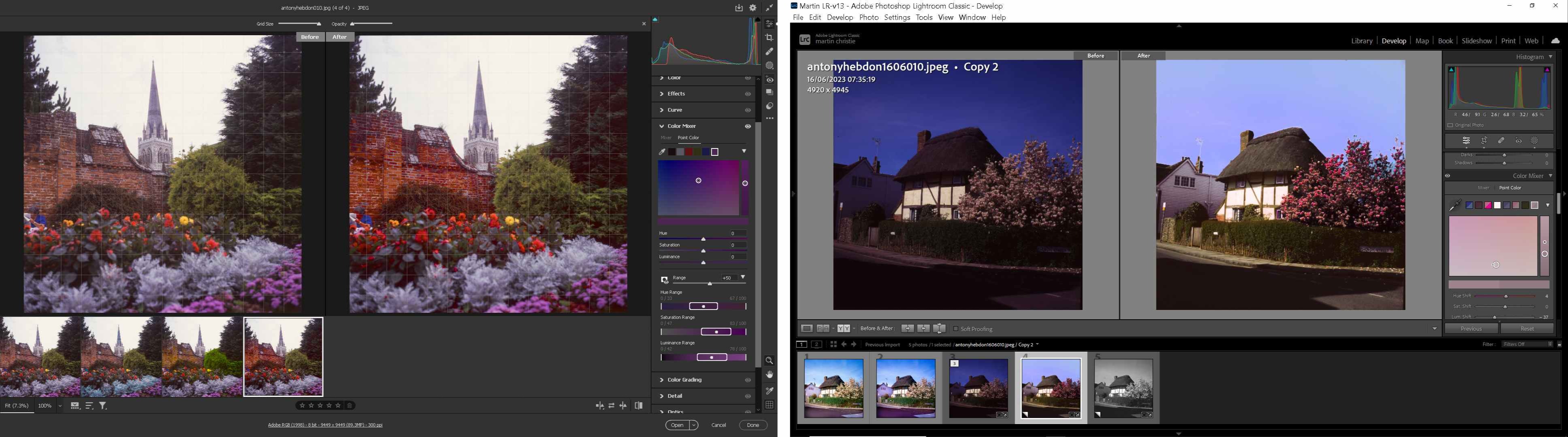
Last month I showed how to alter the individual hues of a multicoloured piece of original artwork, but people require something even more delicate and it has just been introduced into Adobe Lightroom - a variance filter that will enable you to manually blend shades of similar colours to create a more pleasing output.
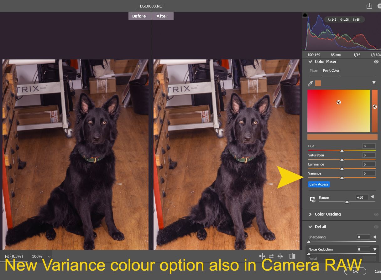
The good news is that generally features trialled in Lightroom will eventually feed into PS but there is a little automated feature hidden away in Filters>Neural Filters. It’s called literally Harmonization and will use a little basic AI to blend colours from different layers more seamlessly into an image.
I don’t normally feature Lightroom as it’s a more specialist photography product from Adobe and doesn’t support either vector files or CMYK colour space. However with an increasing variety of image files from new mobile devices, including advanced RAW files, it is worth visiting as part of an overall workflow and will feature next time out.
.jpg)

.jpg)